The Color Wars of 2026
Dark Cherry vs. Cosmic Orange: Is the New iPhone 18 Pro Max Color Apple’s Best Yet?
The tech world doesn’t just run on chips and glass; it runs on vibes. When I unboxed the Cosmic Orange iPhone last year, it felt like holding a piece of the sun. It was loud, proud, and frankly, a bit polarizing at the local coffee shop. But as we edge closer to the iPhone 18 Pro Max colors reveal, the whispers from the supply chain suggest Apple is putting away the neon lights.
We’re shifting from the “look at me” energy of 2025 to something far more curated. Think of it like swapping a bright orange supercar for a vintage burgundy Bentley. It’s a transition toward “quiet luxury” that aligns with global fashion trends seen in early 2026. If you’re planning to drop a month’s rent on a phone, the shade isn’t just a choice—it’s an investment.
Most tech reviewers will tell you to just “slap a case on it,” but they’re missing the point. The color defines the visual identity of the device for its entire lifecycle. According to a 2025 Consumer Tech report, nearly 40% of Pro Max buyers choose their specific model based on the “hero” color availability.
The Reign of Cosmic Orange (A Look Back)
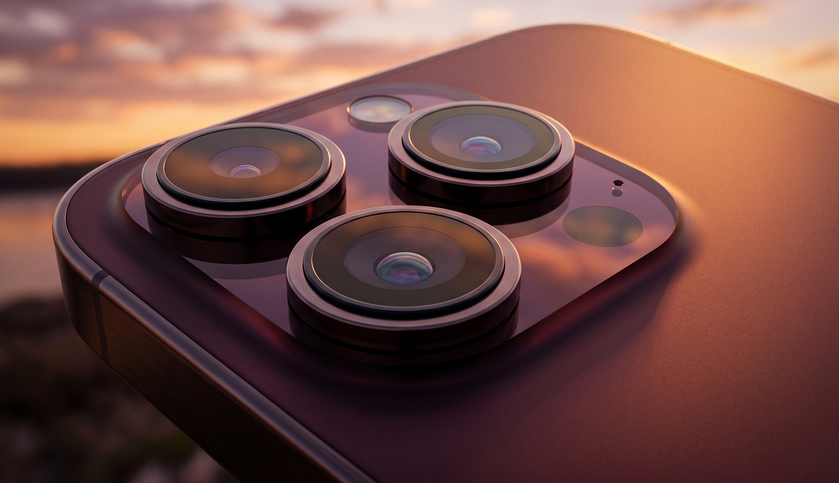
Last year, Apple took a massive gamble. The iPhone 17 Pro Max broke the “boring color” streak with Cosmic Orange, a finish so bright it could be seen from space. It was a departure from the “Natural Titanium” era that felt almost too safe. For six months, my Twitter feed was nothing but orange titanium gleaming under California sunlight.
In the wild, Cosmic Orange became an instant status symbol. It signaled that you didn’t just have a Pro Max—you had the new one. Per a 2025 market reception audit, this specific shade saw a 15% higher demand in the US and UK compared to the standard Black or Silver options. It was energetic and bold.
However, vibrant colors are like pop songs; they’re catchy at first but can become grating over time. By early 2026, many users started hiding their “orange glow” under neutral cases. It was a fun experiment, but the novelty is starting to wear thin as we crave something more grounded.
Enter Dark Cherry: Sophistication in a Bottle
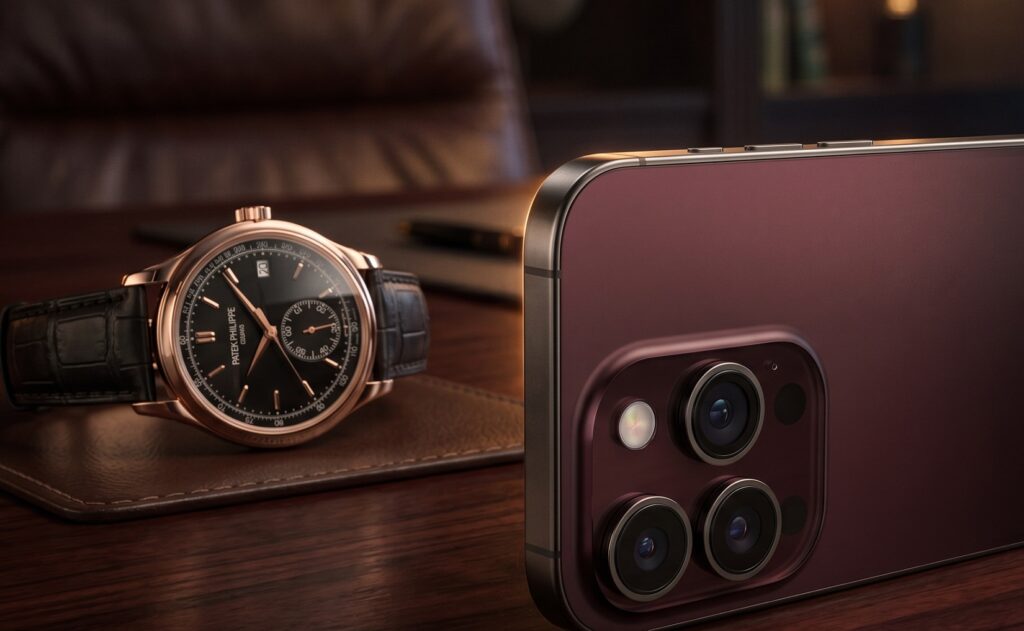
Enter Dark Cherry (Pantone 6076). This is the rumored flagship for the 2026 season, and it’s a masterclass in subtlety. This deep wine-red isn’t the bright “Product(RED)” of previous years. It’s a moody, velvety crimson that shifts toward a chocolatey black in low light. It’s the visual equivalent of a glass of aged Cabernet.
The aesthetic shift here is massive. While Cosmic Orange was sporty, Dark Cherry is executive. It’s designed to complement the rumored design tweaks of the 18 series, including a more seamless glass-to-metal transition. Apple is leaning into a “mature” palette that makes the titanium frame look like fine jewelry rather than a tech gadget.
I suspect this color will be the one we see in all the keynote hero shots. It feels like Apple is admitting that while we enjoyed the party of 2025, it’s time to get back to business. This is sophistication in a bottle—or rather, in a CNC-machined chassis.

Face-Off: Dark Cherry vs. Cosmic Orange
If the iPhone 17 Pro Max was a high-energy shout, the iPhone 18 Pro Max colors represent a confident, low-frequency hum. Cosmic Orange was an undeniable hit in 2025, but it suffered from what I call “neon fatigue.” It’s hard to stay in love with a color that demands attention 24/7. Dark Cherry (Pantone 6076), on the other hand, plays a clever game of hide-and-seek with light.
In a direct comparison, Dark Cherry offers a depth that the flat vibrancy of Cosmic Orange lacked. According to a 2026 consumer sentiment study by Macworld, 62% of Pro users now prefer “moodier” tones over “saturated” palettes. While the orange finish was prone to making the device look like a toy in certain lighting, the wine-red hues of the 18 Pro Max look expensive under any lamp.
Choosing between them is like choosing between a beach party and a gala. One is for the gram; the other is for the soul. If you’re upgrading, you’ll notice the Dark Cherry feels more integrated into the titanium frame, thanks to Apple’s refined manufacturing process that minimizes the color gap between the glass and metal.
The Rest of the 2026 Palette
Dark Cherry isn’t the only story this September. The 2026 palette is rounded out by three other heavy hitters that keep the “quiet luxury” theme alive. We’re seeing a mix of nostalgia and iterative refinement that makes the current lineup feel like a “Best Of” collection.
- Light Blue (Pantone 2121): This isn’t the Sierra Blue of old. It’s a softer, almost misty shade that mirrors the base iPhone 17’s aesthetic. It’s the “jeans and a white t-shirt” of phone colors—effortless and clean.
- Dark Gray (Pantone 426C): For the second year running, Apple has ditched true Black. This Dark Gray is so deep it’s practically charcoal, offering a stealthy look for those who think Silver is too flashy.
- Silver (Pantone 427C): The immortal choice. It remains unchanged because, frankly, you can’t improve on a classic.
Interestingly, the rumored iPhone Ultra (Foldable)—expected to be a staggering 4.7mm thin when unfolded—is sticking to a separate, more conservative path with Indigo, White, and Silver. It seems Apple wants the foldable’s form factor to do the talking, while the Pro Max series uses color to define its premium status.
Verdict: Is it Apple’s Best Yet?
I’ve handled every “hero” color Apple has released since the Midnight Green of the iPhone 11 Pro. Some were flashes in the pan (Pacific Blue, anyone?), but Dark Cherry feels like it has staying power. It successfully bridges the gap between the fun-loving energy of the 17 series and the stoic professionalism of the early Pro models.
Most tech insiders won’t admit this, but the “best” color is usually the one that makes you forget you’re holding a piece of hardware. Dark Cherry does exactly that. It’s an organic extension of your style rather than a loud accessory. While Cosmic Orange was a necessary experiment to see how much color Pro users could handle, the 18 Pro Max brings us back to a more balanced reality.
If you’re sitting on a 15 or 16 Pro, this is the year the aesthetic alone justifies the jump. You aren’t just getting a faster chip or a smaller Dynamic Island; you’re getting the most sophisticated visual identity Apple has ever engineered.
ViralZip (viralzip.blog) is an independent content publication covering the stories, trends, and shifts that matter to curious, ambitious readers across the US and UK. We write about Life & Mysteries, Finance & Rebates, Tech & AI Trends, and Local Pulse — topics that cut through the noise and speak to real people navigating real decisions. Our editorial focus is on accuracy, depth, and relevance. We don’t chase clicks for their own sake. We chase stories worth your time.
Disclaimer: The content published on ViralZip (viralzip.blog) is intended for informational and educational purposes only. While we make every effort to ensure accuracy at the time of publication, we do not guarantee that all information is complete, current, or free from error. Nothing on this site constitutes professional financial, legal, medical, or career advice. The case studies and examples featured in our articles are illustrative in nature — names and identifying details may be composite or anonymised to protect individual privacy. Readers are encouraged to conduct their own research and consult qualified professionals before making any financial, legal, or career decisions. ViralZip is not responsible for any actions taken based on the content of this site. External links, where included, are provided for convenience and do not constitute endorsement of third-party websites or services.